Applying special effects to CorelDraw objects. Effects in COREL DRAW How to make a painting effect in coreldraw 8
A list of effects that can be applied to raster objects is shown at the bottom of the Bitmaps menu. To apply each of them, you need to specify parameters in the corresponding dialog box, but we will just list the effects.
3D Effects Group
The effects in this group simulate distortions in three-dimensional space.
3D Rotate - rotates the image in space.
Cylinder - the image is “stretched” onto the surface of the cylinder.
Emboss (Relief) - “extrusion” of the image.
Page Curl - The image is placed on a page with a corner curled.
Perspective - the effect of perspective or skew.
Pinch/Punch - the object becomes inflated or depressed.
Sphere - the image is “stretched” onto the surface of the sphere.
Group Art Strokes (Art Means)
The effects of this group simulate drawing in various styles and with various tools.
Charcoal (Coal).
Conte Crayon (Pastel pencil).
Crayon (Wax pencil).
Cubist (Cubism).
Impressionist (Impressionism).
Palette Knife (Spatula).
Pastels (Pastel).
Pen & Ink (Pen and ink).
Pointillist (Pointillism).
Scraperboard.
Sketch Pad (Sketch).
Watercolor (Watercolor).
Water Marker.
Wave Paper.
Blur Group
The effects of this group implement various options for reducing image sharpness.
Directional Smooth is a fairly subtle effect based on averaging the color of neighboring pixels.
Gaussian Blur - averaging taking into account the Gaussian distribution. Can be quite strong.
Jaggy Despeckle - A slight blurring of the image that smooths out jagged lines.
Low Pass (Edges) - smooths out hard edges.
Motion Blur - the image appears “blurred”, as in a photograph of a fast-moving object.
Radial Blur - blur occurs along concentric circles.
Smooth - another subtle smoothing effect.
Soften - reduces the level of color noise in the image, making it softer.
Zoom (Focusing) - simulates the effect of the camera “running into” an object when the focus weakens towards the edges.
Camera group
The Diffuse effect from the Camera group simulates the diffuse scattering that occurs when light passes through a lens.
Color Transform Group
Effects in this group transform the color range of an image.
Bit Planes - the image is divided into color zones by range.
Psychedelic - the image is painted in bright, unexpected colors.
Solarize (Solarization) - imitation of the solarization effect that occurs with a special photography development technology.
Group Contour
With the help of these effects, a photographic image is converted into a set of thin lines, while remaining rasterized.
Edge Detect - outlines the outline of the object with a thin line.
Find Edges - relatively uniform color areas are outlined with a thin line or filled with an average color.
Trace Contour - Creates a colored contour image based on the specified brightness threshold.
Creative Group (Formation)
The effects of this group allow you to create various graphic images based on the original one.
Crafts (Tiles) - a mosaic of homogeneous elements.
Crystalize - an image consisting of crystal faces.
Fabric (Fabric) - imitation of a patchwork quilt or embroidery.
Frame - The image is placed in a frame.
Glass Block - the image appears to be viewed through a glass block.
Kids Play (Game) - imitation of a child's drawing or children's construction set.
Mosaic (Mosaic) - a mosaic made of very small elements.
Particles - Small translucent stars or bubbles appear in the image.
Scatter - simulates viewing through scattering glass.
Smoked Glass - simulates viewing through smoked glass.
Stained Glass (Stained Glass) - imitation of stained glass.
Vignette - creates a vignette around the image.
Vortex (Whirlwind) - the image is smeared in a spiral emanating from the center.
Weather - simulates natural phenomena: snow, rain or fog.
Distort group
This group of effects contains options for artistic image distortion.
Blocks - the image is divided into rectangular fragments, shifted relative to each other.
Displace - the pixels of the picture are replaced by a graphic fragment, which can be any raster image.
Offset - Parts of the image are shifted by a certain amount. Offset - Parts of the image are shifted by a certain amount.
Pixelate - This effect causes the pixels that make up the image to become larger.
Ripple - wave-like distortion of the image.
Swirl - The image is swirled around a point.
Tile (Mosaic) - reproduction of reduced versions of the image.
Wet Paint (Liquid paint) - imitation of paint smudges.
Whirlpool - allows you to create an imitation of a fleecy surface due to small “whirlpools” randomly placed in the image.
Wind - simulates a side wind.
Noise Group
The purpose of the commands in this group is to add and remove noise - random spots of color.
Add Noise - Adds a “classic” noise option.
Maximum - increases brightness, which leads to the disappearance of small dark spots.
Median - increases the proportion of colors of average brightness.
Minimum - decreases brightness and increases the proportion of shadows in the image.
Remove Moire - removes moire from scanned images obtained from printed originals.
Remove Noise - Removes color noise by slightly reducing the sharpness.
Sharpen group
Effects in this group are used to sharpen the image.
Adaptive Unsharp - increases contrast at the border between colors.
Directional Sharpen - increases contrast in areas of significant brightness differences.
High Pass (Add brightness) - adds gray color while simultaneously highlighting the edges.
Sharpen - not too obvious sharpening.
Unsharp Mask - more obvious sharpening.
Plug-Ins
Plug-ins are mini-programs, often from third-party developers, that allow you to perform specific functions. Connecting such modules is very simple. Let's say you want to use filters familiar to you from Adobe Photoshop to process raster images. Open the Workspace/Plug-Ins page of the Options dialog box and click the Add button. The Browse for Folder window will appear, in which you need to specify the folder containing Photoshop filters (by default - C:\Program Files\Adobe\Photoshop X.X\Plug-Ins).
Close the Options window and restart CorelDRAW. In the Bitmaps > Plug-Ins submenu, the commands you are familiar with will appear.
If you clearly know which groups of filters you will use, do not be lazy and connect them separately. Or create a new folder, copy only the necessary modules into it, and connect it. The fact is that not all Photoshop modules are filters - these can be tools, productivity modules, and individual menu items. Connecting them will only slow down the program. Moreover, some filters (for example, Photoshop CS2) may not work in CorelDRAW.
Steve Bain; Translation: Bersi
Applying bevels to graphics in earlier versions of CorelDRAW ® certainly wasn't simple or easy, and the results were probably underwhelming. However, that all changed with the introduction of new bevel effects in CorelDRAW X3. Now you can add a third dimension (see below) and adjust the bevels with color depth and adjust the lighting. This new feature is a useful addition to the features available in CorelDRAW.
In addition to the fact that a fully customizable bevel can be created dynamically linked to the original object, they are applied so that you can always adjust and change the slope of the bevels. CorelDRAW X3 also allows you to specify CMYK highlight and shadow colors, making this effect extremely versatile.
You can apply your chamfers to almost any closed vector shape, as long as you haven't already applied other advanced effects to it. A closed vector shape can be artistic text, a standard shape (such as rectangle, ellipse, and polygon), or any other shape.
The functions in the bevel settings window are represented by choosing the style (Style), the size of the bevel (Bevel Offset), setting the shadow color (Shadow Color), as well as the color and characteristics of the light (Light controls). The Apply button applies all selected changes to the shape.

When applying a chamfer effect, the original object becomes the controlled object. That is, any changes made to it are automatically updated on the figure image.
If you're new to CorelDRAW X3 and have never experimented with bevel effects, the following examples will help you get started. The first example creates a bevel effect in the Soft Edge style. The second example will help create the Emboss effect.
1. Create a closed vector shape and fill it with one color.
2. Open the Bevel window (Window > Dockers > Bevel).
3. Select: Style - Soft edge, Bevel offset - To Center.

4. Select the color of the highlights and shadows. Change the light settings if you want, but you can leave them at default.

5. Click the "Apply" button. The chamfer is immediately applied to the selected object, according to the specified parameters.
While Soft Edge bevels can be applied quickly to almost any existing shape and look great in almost any shape arrangement, the same cannot be said for Emboss style bevels. Successful use of Emboss bevels requires more setup time. Follow these steps and you'll see what I mean.
1. To apply the Emboss bevel, you need to create two objects: the first is the object itself (the main one) to apply the bevel to, and the other, larger shape, will serve as the background. Both objects must be filled with color. Remove the outline of the objects (search - the outline settings are always placed next to the fill settings, select no outline in the list of options).

3. When you select Emboss, only Distance is available in the Bevel Offset settings section. Specify the distance to adjust the bevel amount.

4. Set the color of the highlights and shadows. If desired, use the sliders to fine-tune the light (see sliders below).
5. Click the "Apply" button.

The bevel effect can be adjusted at any time by selecting the object, going to the Bevel window, making a new adjustment and clicking the "Apply" button.
Chamfer functions
Here are some examples of using chamfers with different parameter settings for clarity:


Adjusting Light and Shadow
By adjusting the colors of light and shadow, as well as the amount of bevel, you can achieve a variety of interesting effects:


Using Light Settings
By adjusting three sliders: Intensity (intensity), Direction (direction/angle of the light beam), and Altitude (height/distance from the light source to the object), you can fine-tune the light on your bevel.


Direction (responsible for the angle of incidence of the beam from the light source to the object, the shadow will accordingly be on the opposite side):


If you have difficulty applying chamfers to an object, make sure the object is a closed path and has a color fill. Filling is necessary to apply the chamfer effect. Both bevel styles apply only to solid fills, although the Emboss bevel can be used with other fill types. The shape's stroke properties will remain, but they will not affect the result of applying the chamfer.
Bevel layers are dynamically linked, but you can use the Break Bevel Apart command (Arrange > Break Bevel Apart or Ctrl+K) to separate bevel layers.

To remove the Soft Edge chamfer effect, use the Effect > Clear Effect command. To remove the Emboss bevel effect, select the main object and apply the same command.
By swapping the colors of light and shadow, you can get two different effects: depression and convexity.

Also, using the Interactive Drop Shadow tool of the main toolbar, you can add a shadow from an object with a chamfer to the working surface, as if lifting the object above the surface.

The bevel effect is a useful addition to CorelDRAW X3's arsenal of artistic effects. The effect can be applied quickly, does not require much training, and is also relatively easy to use. By being able to control the depth, color and lighting of your bevel, truly customized results can be produced.
Steve Bain is an acclaimed illustrator and designer, the author of more than a dozen books, including CorelDRAW ®: The Guide.
Date of publication: 02.11.2012
Does drawing a portrait without the skills of an artist or having never had an art education behind you seem very difficult? In this lesson we will look at how you can do without long training with good results. We will draw a portrait from a photograph, simplifying complex details, creating layers to make our work easier.
Let's say right away that the first pancake will most likely be lumpy.
1. Photography
2. Let's start with the face
3. Select a sample
4. Light and dark
5. Draw facial features
6. Adding Highlights
7. Let's get down to details
8. Draw the eyes
9. Check with the original
10. Draw the mouth
11. Hair. Let's start with color
12. Lighter now
13. Wear a T-shirt
14. Maximum effect
15. Adjusting contrast
Portrait in CorelDraw - final result
Photo
1.1 Find the photo we need and open it in a new CorelDraw document (File > New > Import > file name)

rice. 1.1 Selecting a photo
1.2 Make a bookmark in the right menu (Window > Dockers > Object Manager)
1.3 Create a new layer in this menu (New Layer) and name it, for example, “pic”
1.4 Block our object (in the right menu, click on the small pencil icon)
Let's start with the face
2.1 Create the next layer on which to draw the face.
2.2 Let's call this layer “face”
2.3 Using the Freehand Tool, we begin to repeat the features of the face, neck and body.

rice. 2.3 Freehand Tool
2.4 It is best to use thin lines, say hairline thickness. This can be configured in the panel below the top menu.

rice. 2.4 Contour of face, neck and body
Choosing a sample
3.1 After drawing most of the lines of the face, you need to select the main skin tone from the imported image. Tool - Eyedropper Tool

rice. 3.1 Eyedropper Tool
3.2 Click on the picture until we select a color that we like and which can be used as the main skin tone.
3.3 Fill the drawn outline with the selected color.

rice. 3.3 Face fill
Light and dark
4.1 Now you can start creating a palette of skin tones. Choose a shade in the picture that is darker than the main one. These will be darkened areas of the skin. In the same way, you need to choose a color for the illuminated areas.
rice. 4.1 Dark areas of the face
Drawing facial features
5.1 Using a darker shade, we continue to draw the darkened areas of the face with the Freehand Tool (see section 2.3.). Let's name the layers Shadow dark and Shadow light

rice. 5.1 Contour of dark areas of the face
5.2 Add darker colors to the palette and work on the darkest areas, after which we move on to the details.
Adding Highlights
6.1 Having finished with the shadows, we move on to the light areas. Perhaps the easiest way here is to hide the layers with shadows on the face so that you can better see the original in the photo. To hide layers, click on the small eye in the left toolbar (where we create layers) next to each of them.

rice. 6.1 Light areas of the face
6.2. In order to get realistic, delicate light areas, you can not select colors by searching, but use a white fill and experiment with the transparency of the Interactive Transparency Tool

rice. 6.2 Experiment with transparency
Let's get down to details
7.1 Let's get down to the small details: let's start with the nose and eyebrows. At this stage, the face gradually becomes more realistic and closer to what we want to see.

rice. 7.1 Eyebrows and nose
7.2 Create each part of the face (eyebrows or nose) in different layers and, after they are completely finalized, fix them in the right toolbar with a “small pencil”.

rice. 7.2 Toolbar "small pencil"
Drawing the eyes
8.1 Draw the main elements of the eye, such as eyelashes, eye contour, pupil and iris, and fill them with colors.
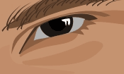
rice. 8.1 Drawing the eye
8.2 The color of the white of the eye should not be bright white, so that it does not catch the eye, let’s make it pale grayish.

rice. 8.2 Darkening the eye
8.3 To give your eyes shine, colors need to be selected very carefully, studying them in the photograph. It is also necessary to determine in advance which details need to be slightly exaggerated compared to the original.

rice. 8.3 Simplification of elements
8.4 The brightest detail of the eye will be a small highlight on the pupil.

rice. 8.4 Glare on the pupil
Checking with the original
9.1 Now copy the photo, having previously unlocked it, and paste the copy on the side of our illustration. This will help you adjust all the shades of colors so that they combine most successfully and harmoniously with each other. This can be done most productively by comparing a separate photograph and a drawing.

rice. 9.1 Comparison of drawing and photo
Drawing a mouth
10.1 Work on the mouth begins with its main outline drawn with the Freehand Tool and filled with a suitable slightly pinkish color.
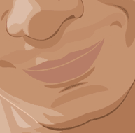
rice. 10.1 Drawing the outline of the mouth
10.2 Add an intermediate shade of dark color for the upper lip and about two shades lighter for the lower lip.

rice. 10.2 Arrangement of shadows on the lips
10.3 Draw the darkest stripe, the one where the lips meet.

rice. 10.3 Dark line on lips
10.4 Create a highlight on the lips in the same way as we painted the eye. Let's add a little transparency to it using the Interactive Transparency Tool in the left toolbar.

rice. 10.4 Interactive Transparency Tool
Hair. Let's start with color
11.1 Hair should also be painted on a separate layer. We create their main outline with the Freehand Tool, without going into too much detail, and paint them with a gradient or a regular tone. This will be the main hair color.

rice. 11.1 General hair contour
11.2 Draw small curls separately from the main body of hair (also with the Freehand Tool.)

rice. 11.2 Small hair details
It's lighter now
12.1 Now use the Freehand Tool to draw lighter areas on the hair and fill them with a light brown tone.

rice. 12.1 Light parts of hair
Wear a T-shirt
13.1 Let's determine the main colors of the T-shirt. In our case, these will be different shades of blue.

rice. 13.1 Drawing the outline of a T-shirt
13.2 Draw folds on the T-shirt. They also need to be drawn with the Freehand Tool. First dark, then light. It’s better not to overuse details, since our main task is to focus all the viewer’s attention on the face.

rice. 13.2 Folds on the shirt
Maximum effect
14.1 Everything is fine, but a little work on the details to achieve maximum effect will not go amiss. Select the main object in the group of face objects and, using linear transparency, use the Interactive Transparency Tool to change its sharp edges to vanishing ones.

rice. 14.1 Interactive Transparency Tool
14.2 Change the direction so that the transparency is as smooth as possible.

rice. 14.2 Working with transparency
Adjusting the contrast
15.1 Apply the same shadows with soft transitions to other areas of the skin.

rice. 15.1 Adjusting transparency
15.2 Looking at the illustration as a whole, we see what points we need to improve.
15.3 Add a background, whichever you like best.

rice. 15.3 Finishing work with the background
15.4 The main rule is that everything should always be in moderation.
The blend effect creates a series of objects between two control objects. Control objects can be closed or open curves or a group of objects. If the control objects match in shape and color, then the effect creates a series of identical copies, otherwise there is a gradual transformation of one object into another. Using this interesting property of the tool, you can create three-dimensional effects or objects of complex shape. In this article we will look at the technology for creating the flow effect and give several examples of its application.
Simple Blend
To create a flow, you must first create two objects that may differ from each other in shape and color. After selecting a tool Blend(Flowing) should draw a line from the center of one figure to the center of another. The tool will automatically create a series of objects between these original shapes. In Fig. Figure 1 shows an example of constructing a flow between two figures: a star and a circle. Blue arrows indicate control object markers, red arrows indicate a flow path indicator, green arrows indicate an object acceleration marker, and yellow arrows indicate a color acceleration marker. The first and last flow objects are called control objects, the others located between them form a flow group.Rice. 1. Interactive markers that control the settings of the blending effect
Rice. 2. Changing the position of control objects
Using the following markers you can adjust the effect:
- control object markers are used to change the position of the first and last objects in the flow, and the distance between the group objects changes automatically (Fig. 2);
- Acceleration markers are used to change the color and distance between objects in a group. For example, when the acceleration marker of an object (upper triangle) is shifted to the right, the group of objects will shift to the second control object (circle), and when the color acceleration marker (lower triangle) is shifted to the right, the green color of the objects in the group will prevail over the red (Fig. 3).

Rice. 3. Changing the acceleration of an object (a) and color (b)

Rice. 4. Linking and unlinking accelerations: a - on the properties panel, b - on the Blend panel
By default, when a blend effect is assigned, both handles are in the center of the blend path (see Figure 1) and are linked, meaning the object's acceleration and color changes simultaneously. To break the connection, click the lock button on the tool's property bar or uncheck the Link accelerations(Acceleration Link) on the dockable panel Blend(Overflow) - fig. 4.
Other settings can be made using the buttons on the tool's properties panel or on the Blend(Overflow). Options Blend Steps(Blend Steps) and Blend Space(Blend interval) set the number of blending steps and the interval between steps; by default, 20 group objects are created (Fig. 5).

Rice. 5. Examples of using the Blend Steps parameter: a - the value is 50; b - 10; at 4

Rice. 6. Example of using the Blend Direction parameter
Parameter Blend Direction(Blend direction) allows you to create a blend with rotation, in Fig. 6, the last object of the flow group is rotated by 45°.
If the direction of flow is not set equal to 0°, then the parameter becomes available Loop Blend(Flow with repeat). Clicking the Loop Blend button performs a rotation effect while simultaneously shifting the blend group objects relative to the path. In Fig. Figure 7 shows two effects with the same settings: the rotation angle is set to –180° and the button is pressed Loop Blend(Flow with repeat). But in the top picture, both control objects are left unchanged, and in the bottom picture, one flow control object (indicated by a red arrow) is reflected horizontally.
Rice. 7. Examples of using Blend Direction and Loop Blend parameters together
The next three buttons on the toolbar are Direct Blend(Direct flow), Clockwise Blend(Flow clockwise) and Counterclockwise Blend(Counterclockwise flow) - responsible for the color transition. The first button, pressed by default, creates the effect of a smooth color transition from one color to another. The remaining buttons allow you to set the color transition through the visible spectrum (Fig. 8).

Rice. 8. Color transition options
When setting up a blend effect, what objects are selected matters a lot. If you click with the tool Pick(Selection) on one of the control objects, it will be selected. You can perform various actions with the selected control object, as with a regular vector object: scale, rotate, move, edit its nodes, flip horizontally or vertically, etc. After editing this object, the flow group objects are automatically converted. So, in Fig. 9, when rotating the top control object, all objects in the flow group automatically changed.

Rice. 9. Editing a control object

Rice. 10. Editing blend group objects
If the tool Pick(Select) Click on one of the objects in the flow group, and the entire group will be selected. In this case, we have access to editing the blend parameters using the buttons on the tool's properties panel Blend(Blend), but first you must select this tool again (Fig. 10).
Multipoint Blend
Each blend group object can be designated as a child object and edited as a control object, which in turn will affect the appearance of the blend effect. Let's look at an example.Let's create a simple blend between the two shapes, then double-click on the group object, which will be the separation point. In Fig. 11a there are two such objects (they are indicated by green arrows). Then we will move the markers of the child objects. In Fig. 11b, child and one control objects were moved. Please note that any child object can be edited as a control object, and the objects of the flow group will be automatically redrawn (Fig. 11c).


Rice. 11. Flow with two separation points (a); change in the position of subsidiary and manager objects (b); result of editing a child object (in)
You can also use the disconnect button Split(Disconnect) in the docked Blend panel or toolbar. As a result of clicking this button, the mouse pointer is displayed in the form of a curved arrow, which should be used to click on the desired object from the flow group (Fig. 12).

Rice. 12. Using the Split button to separate the flow
To connect the blend, double-click on the child object's handle.
Composite Blend
Composite blending is used between three or more objects. It is necessary to first prepare control objects, and then connect them sequentially in the tool operating mode Blend(Overflow). As a result of this, we will get several separate, interconnected flow effects, each of which has its own control objects. Let's look at an example of drawing a dumbbell.Let's create several ovals - future control objects, and fill them with a fountain fill (Fig. 13a).
Then select a tool Blend(Overflow) and sequentially connect the ovals from left to right (Fig. 13b). As a result, we get the image shown in Fig. 13th century And to complete the effect, let's create a copy of the last control object, reflect it horizontally and assign the thinnest outline (Fig. 13d).


Rice. 13. Initial objects for composite flow (a); sequence of connecting ovals (b); the result of applying the bleed effect (c); final image of a dumbbell (g)
Flow along the path
The blend effect can be placed not only along a straight path or a polyline - you can also use a closed or open curve as a path. This flow is formed in two stages: first, a simple flow is built between two shapes, and then it is attached to a pre-built curve. Let's look at an example of drawing a caterpillar.Let's create a normal flow between two shapes. Let's draw a curve along which we are going to place the ovals. Then in the tool properties panel or dockable panel Blend(Flow) press the button Path Properties(Path properties) and select the command New Path(New way). As a result, the pointer will change to a curved arrow, which should be clicked on the curve (Fig. 14a).


Rice. 14. The process of assigning a new path for a simple flow (a); Snap a blend to an open curve using the command New Path(b); final image of the caterpillar (c)
If the shapes are not located along the entire length of the path, simply drag the control objects to the ends of the curve. As a result of our manipulations, the figures should be strung along the entire curve (Fig. 14b).
All the usual actions apply to flow along a path: rotating control objects and group objects, changing the acceleration of the color and object, recoloring the flow, etc. Having slightly edited the resulting effect and completed drawing the face, we get a finished image of the caterpillar (Fig. 14c).
Note that the blend can also be automatically placed along the entire path. To do this, you need to check the box Blend along full path(Blend Along Path) in the tool properties panel or dockable panel Blend(Overflow) - fig. 15.

Rice. 15. Automatic placement of blending along the entire path: a - on the properties panel of the Blend tool; b - on the Blend panel
Rotating blend objects along a path
In addition to rotating objects at an arbitrary angle, it is possible to automatically align objects in a blend group according to the orientation of the path itself. The second checkbox is used for this. Rotate all objects(Rotate All Objects) in the properties panel or dockable panel Blend(see Fig. 15).In Fig. Figure 16a shows a group of ovals strung on an open curve.
Let's make them look like beads. To do this, it is necessary to align each oval along the path so that the thread “pierces” each bead along the long axis of the ellipse. Let's rotate each of the control objects as required, but as a result of this, the size of the ovals located in the center of the curve has decreased slightly (Fig. 16b). To correct this shortcoming, check the box Rotate all objects(Rotate all objects) - fig. 16th century Now let’s reduce the number of objects in the blending group and move the “thread” to the background (Fig. 16d).


Rice. 16. Result of placing a simple flow along the curve (a); the result of rotation of both control objects (b); the result of checking the Rotate all objects checkbox (c); final image of beads (d)
Editing the Blend Path
A path on which flow objects are already strung can be edited like a regular curve. But first you need to select it - for this you use the command Show Path(Show Path) in the properties panel or dockable panel Blend(Overflow) - fig. 17.
Rice. 17. Selecting a path using the Show Path command: a - on the properties panel of the Blend tool b - on the Blend panel

Rice. 18. Example of editing a flow path
After selecting a path, you can perform various actions, for example, edit nodes and curve guides (Fig. 18).
If you want to make the path invisible in the final effect, deselect the outline color for it. And when you need to edit it, run the command Show Path(Show the way).
Cancel blending
To cancel the blending effect, click the last button on the tool's property bar or run the command Effects(Effects) → Clear Blend(Remove overflow).As you can see, the capabilities of the blending effect make it a really very useful and indispensable tool for a designer when working with objects in the CorelDRAW editor.
Based on materials from COREL Magazine
Many artists who want to try their hand at vector graphics are discouraged by the many tools, features and settings CorelDRAW offers. Despite the fact that on our website CorelTUTORIALS, as well as on the Internet in general, you can find many detailed lessons on creating specific images, an overview of the capabilities of CorelDRAW and its tools, very little attention is paid to the practical side of their use and drawing techniques. That is why I decided to introduce you to how I approach the issue of illustration.
In this lesson I will share my own experience using the example of my latest work “The Elven Saga” and the tools that I use most often. Perhaps I will not discover something fundamentally new for some of you, however, the way I work in the program will be useful for everyone and will help to understand the abundance of all the functionality of CorelDRAW X7.
The lesson uses the Russian version of CorelDRAW X7

So the main tools I use are Palette Knife, Free Form, Art Media and Transparency. The image above shows their standard location in the left panel.
Freeform Tool:
More often than others, I turn to the Free Form tool (accessed by pressing the F5 key), because most of the work is done with this tool. Let's look below at techniques for creating sketches, solids, and watercolor effects using FreeForm in combination with other CorelDRAW X7 features.

Sketches, or, to use a more traditional word, outlines, are created by many people, including me, using the Free Form tool. Some people choose to use graphics tablets, others choose the new CorelDRAW X7 feature that supports input from touch screens, drawing with a finger directly on the monitor, someone else draws on paper and then scans the image, and I create my work directly using the mouse, which saves a lot of time on switching between manipulators and devices. Any drawing begins with a sketch, because our idea must acquire some visual boundaries, obtain a visual image to show to the customer or not lose the idea if the work is very large-scale. As you can see in the image above, the sketch was created using the Free Form tool and the original idea underwent a number of necessary changes.
CorelDRAW not only allows us to edit the line thickness of our sketch, as shown in the screenshots below, but also to turn our freehand curve into, for example, a path for text or a brush for the Art Media tool:

My favorite technique in illustration is the use of “solids” (translucent objects or, as is customary in the original language, “shapes”). This technique allows you to imitate both the techniques and elements of raster graphics and watercolor effects, creating the illusion of a drawing created not in vector, but with paints. This is a very labor-intensive process, but if you master this technique, you can create truly impressive paintings, because one of the main complaints against many vector graphics artists is the visual primitiveness of their work.
The example below clearly demonstrates how a portrait is created using primitive shapes and translucent objects (a combination of the Free Form and Transparency tools). By layering elements created using Free Form with transparency on top of each other, layer by layer, we get great results. The more objects we use, the denser and more saturated tones we will get, as well as the deeper degree of drawing of all the details, in this case the face.

As you can clearly see in the screenshot above, when working with vector graphics, I use the traditional artistic technique of “from dark to light.” This technique allows you to monitor the density so that the background or other elements are not visible behind the “holes” made when joining the forms, to give it saturation and greater volume, which also affects realism. The “from dark to light” technique gives the necessary control over the transitions of color and shadow, softness and the ability to beautifully darken/lighten certain areas.
Let's take a closer look at the technique of using “blanks” (translucent objects), using the example of a branch with leaves, which is located in the foreground, in the lower right corner of the final illustration:

Transparency Tool:
I will not dwell in detail on the choice of color shades and step-by-step drawing instructions, since this lesson is an alternative to all analogues, it is intended specifically for artists who want to master vector, and not for designers who do not have practical illustration skills.
Draw the main shape (the boundaries of the entire future object) of the petal using the Free Form tool.

Fill this form with color (G key, or click on the paint bucket icon on the left panel, as well as at the bottom right).

Transparency comes in several types: “uniform”, “fountain” and various types using patterns and textures (we will not consider the last type in detail). "Homogeneous Transparency" is the main type of effect I apply to objects. "Fountain Fill" There are several types - linear, radial/elliptical (we will look at this later), conical, rectangular.

We apply the so-called strokes, imitating them by drawing dies, until our branch with leaves takes on its final form.

The result of drawing flowers with dies that adorn the hair of an elven warrior.

A similar technique of using the transparency tool to simulate the work of a brush can be considered using the example of a unicorn. We start with a free form, making a sketch, and then add the necessary elements one by one.


In my works I try to avoid hyperrealism so that the viewer has the opportunity to enjoy the strokes, as in the original painting - the drawing should remain a drawing, you should not struggle with the camera in your works.

Palette knife tool:
When editing the boundaries of an object, you can use the tools for editing groups of objects. The Fit function will trim the edges of your desired object to fit the specified boundaries of the new shape located on the layer above.

However, from an artistic point of view, clear edges and boundaries are not always necessary in a drawing, so the Palette Knife will help to better solve this problem.

As in real life, this tool helps to correct ugly edges when the paint goes beyond the outline of the object, or to smear any part of the drawing, giving a new direction to the stroke.

They are also very convenient for assigning arbitrary tilts and distortions to entire groups of objects, as shown in the example below when working with drapery, texturing fabrics and other surfaces.

If we focus on the area of application of the new Palette Knife tool, it is truly significant. After all, this is drawing hair and hair, simulating paint drips, editing shapes, etc.
"Decoration"
The Art Tools are essentially artistic brushes, sprays, and drawing elements. CorelDRAW allows you to both create your own brushes (unfortunately, our tutorial will not cover this) or use ready-made ones. Using brushes, you can quickly draw arrays of hair, fur, grass, create strokes that fill the background as a texture, leaves, etc. In general, in combination with the transparency tool, you can achieve amazing results, comparable to drawing in raster editors. However, there are some subtleties to using brushes in vector. Each stroke or group of strokes must be converted into curves and converted into objects for further editing - filling with a gradient of colors or adding transparency.
Let's look at the use of brushes when drawing eyebrows.
To begin, select the Art Media tool from the left toolbar (or press the i key) and use the selected brush shape to create some strokes.

To be able to manipulate our newly created elements, we convert them into full-fledged vector objects by pressing the keyboard shortcut ctrl + K, or by calling up the menu for editing selected objects with the right mouse button and selecting the command there - unlink the artistic design group. Now, using the fill, you can choose the color of the eyebrow hairs we need.

Having placed our artistic strokes in the desired area of the drawing, we can edit the shade using the “dropper”.

The same goes for drawing hair. However, it is worth remembering that the hair closer to the edge is thinner and lighter, and also do not forget about shadows and different shades.
As you can see, mastering even a small group of basic tools allows you to fully reveal your talent as an illustrator. I hope now it has become much clearer to you what vector graphics are and how you can create your own masterpieces using the CorelDRAW X7 vector editor. If you are interested in the topic of illustration in vector graphics, and you want to master the proposed capabilities of the program in more detail, go to, be diligent and everything will work out!